
Fixing mobile layout and dial input in the Pomodoro timer
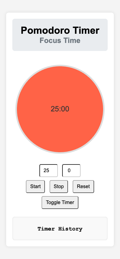
On 20 November 2026, I released fixes for the English and Korean Pomodoro timers. The layout now stays within the viewport on narrow screens, and the dial reads clicks against the canvas’s displayed size. Previously, the timer card could extend beyond the viewport and its top edge could move out of view. The dial could also select the wrong duration after CSS scaled the canvas down.
The timers keep their existing 25-minute focus and 5-minute break defaults. The English guide and Korean guide explain the controls. The live applications are available in English and Korean.
Why the layout broke on mobile
The timer container had a width of 350 pixels and 20 pixels of padding on each side. Because the default box model did not include padding in the declared width, the rendered container was 390 pixels wide. The body also had a fixed height: 100vh and vertically centred the card. When the card became taller than the viewport, its top edge moved above the visible area.
The canvas draws into a 300 × 300 pixel buffer, while CSS can display it at a smaller size. The old hit-testing code used the intrinsic canvas dimensions to calculate the centre, even though pointer coordinates came from the displayed rectangle.
The regression case uses a 200 × 200 displayed canvas at left: 20, top: 50. A click at 219, 150 should select 375 seconds (6:15). The old calculation returned 185 seconds (3:05).
Changes to the layout and dial
The body now uses min-height: 100vh, border-box sizing and 16 pixels of padding. The timer container has max-width: 100% and border-box sizing. The canvas uses max-width: 100% and height: auto, so it can shrink without changing its aspect ratio. Inputs and buttons also use border-box sizing.
The dial centre now comes from the canvas’s displayed rectangle:
const rect = this.canvas.getBoundingClientRect()
const centerX = rect.left + rect.width / 2
const centerY = rect.top + rect.height / 2
The drawing buffer remains 300 × 300 pixels. The pointer calculation now uses the same displayed dimensions as the click position.
Regression tests and live browser checks
Each application repository has three Node tests for the timer interaction:
- The app initializes against the actual
timerCanvaselement. - A click at the quarter-circle position selects 375 seconds and updates the minute and second inputs to 6 and 15.
- The same interaction works when CSS scales the displayed canvas to 200 × 200 pixels.
All six tests across the two repositories passed.
I checked both live pages in headless Chrome at 280 × 600, 320 × 640, 375 × 667, 390 × 844, 768 × 1024 and 1440 × 900. Neither edition had horizontal overflow at those sizes. At widths of 280, 320 and 375 pixels, the timer card started 16 pixels below the top of the viewport, and the canvas displayed at 208, 248 and 300 pixels respectively. Vertical scrolling remained available, and the existing desktop geometry was preserved.
I also repeated the dial click test on both live pages at widths of 280, 320 and 375 pixels. All six combinations selected 375 seconds and displayed 6 minutes and 15 seconds in the inputs.
Both application releases are live
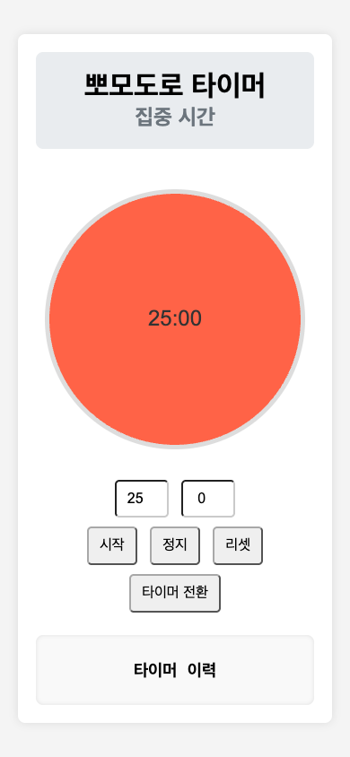
The English change was merged in PR #2, and the Korean change in PR #2. The English merge commit and Korean merge commit contain the CSS, JavaScript and regression-test changes.
Both GitHub Pages deployments succeeded. The live English timer and Korean timer return HTTP 200. Their served CSS and JavaScript files also match the tested source files byte for byte.
The browser checks cover the six viewport sizes and the dial positions exercised in the tests. They do not measure user adoption or establish behaviour on every physical phone.